
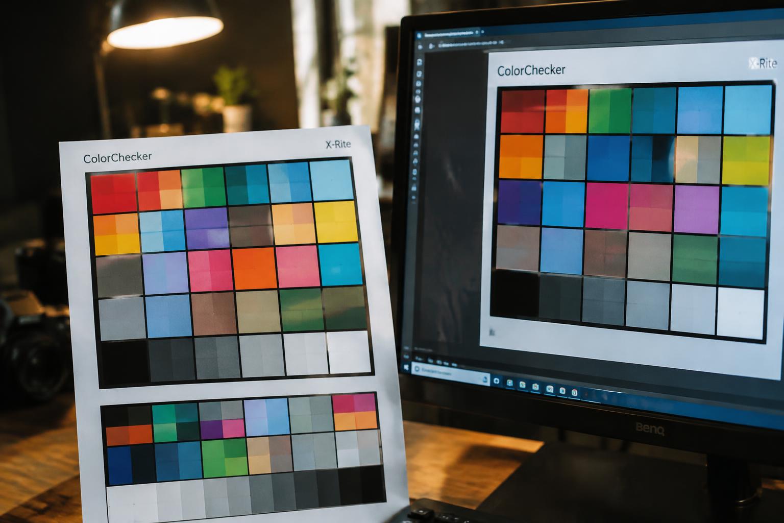
A bright blue on your monitor can emerge from a printer muted or slightly purple, even when your file looks perfect. Your screen creates color with emitted light, while printed ink reflects light from paper, so the two mediums have different color ranges. Display settings, ink, and paper all affect the result, and a glossy sheet can make the same image appear deeper than uncoated stock.
Key Takeaways:
- Screens create color with emitted red, green, and blue light, while printers use cyan, magenta, yellow, and black inks or toners on paper. These different color systems cannot reproduce every color in the same way.
- Display brightness, color calibration, printer profiles, ink, and paper all affect the result. A vivid color on a backlit monitor can look duller on uncoated paper.
- For more predictable prints, calibrate the monitor, use the correct printer and paper color profile, and soft-proof the image in color-managed software before printing.
How Screens and Printers Create Color
Your screen and printer build color through different physical processes. A display produces light for your eyes, while a printer deposits ink onto a surface that reflects light. Knowing which process is at work clarifies why each device handles color in its own way. A monitor uses tiny red, green, and blue light sources; a print engine places cyan, magenta, yellow, and black ink on paper. These are distinct systems, not interchangeable materials.
| Device | Color process | Primary components |
|---|---|---|
| Screen | Emits light | Red, green, blue |
| Printer | Reflects light from ink on paper | Cyan, magenta, yellow, black |
| Printed surface | Receives layered ink | Paper and ink |
RGB color on screens
Each pixel on your display combines red, green, and blue light at varying intensities. At full strength, those three channels appear white; with all channels off, the pixel appears black. Your phone, laptop, and desktop monitor use this additive color model to render images, text, and interface elements. Because a screen creates color by emitting light directly toward your eyes, its pixels do not rely on ink or paper to produce a visible hue.
CMYK color in print
Print workflows commonly use cyan, magenta, yellow, and black inks, identified as CMYK. The printer applies tiny dots of these inks in controlled patterns, and your eyes combine the reflected light into perceived colors. Black ink, labeled K, supplies deep shadows and crisp text without requiring all three color inks to be layered heavily. In a commercial press, these separations are transferred to paper through distinct ink plates or digital print passes.
How paper and ink affect printed color
Paper provides the surface that reflects light through and around the ink, so its color, coating, and texture influence the finished appearance. Gloss-coated stock reflects light differently from uncoated paper, while an uncoated sheet absorbs more ink into its fibers. Ink formulation and application also shape coverage and surface sheen. A matte photo print, for example, has a different reflective finish from a glossy print made with the same image file.
Why Screen and Print Colors Differ
Your screen and printer interpret color through different systems, so a file that looks vivid on a display does not necessarily produce the same appearance on paper. The gap depends on the color space used by the image, the capabilities of each device, and the light around you. Even two monitors can render the same file differently, while a print viewed under warm indoor bulbs can appear unlike the same sheet under daylight.
Gamut limits and color profiles
Displays create color with emitted light, while printers combine inks on a surface, giving each medium a distinct color gamut, or range of reproducible colors. Highly saturated blues, greens, and oranges often exceed what a particular printer and paper combination can reproduce. An ICC profile describes how a device handles color, but a file viewed without the correct profile may be interpreted differently by a monitor, editing application, or print workflow.
Monitor calibration and brightness
Monitor settings shape the color and brightness you see before a file is printed. A screen set too bright can make a photograph appear lighter than its printed version, while an inaccurate white point can shift neutrals toward blue or yellow. Calibration measures the display and builds a profile for its current settings; without it, your visual reference depends on factory presets, age, and adjustments such as a vivid picture mode.
Paper, ink, and ambient lighting
Paper changes how ink appears because its shade, coating, and surface texture affect reflected light. A bright white, coated sheet typically renders colors differently from an uncoated cream stock, and the printer’s ink set adds another variable. Viewing illumination matters too: warm household bulbs can make a neutral gray print look yellow, while daylight reveals a different balance across the same pigment layers.
- Glossy coatings reflect nearby windows and lamps.
- Optical brighteners can make some papers look bluer under ultraviolet-rich light.
- Inkjet and laser printers use different colorants and reproduction methods.
How to Get More Predictable Print Colors
A dependable workflow links your monitor, editing software, printer, and paper through consistent color management. Start with a display calibrated to a known target, then use the correct profile for the printer and paper combination. A soft proof shows how the image is likely to translate before you commit to a full print. Consistent settings matter across the entire chain; changing a profile or print driver setting between edits can alter the result. For practical context, see why prints look different from what you see on a monitor.
| Workflow step | What you use | What it controls |
|---|---|---|
| Monitor calibration | Display calibrator | Screen brightness and color response |
| Profile selection | Printer and paper ICC profile | Color conversion for a specific print setup |
| Soft proofing | Editing software | On-screen preview of print limitations |
| Test printing | Small proof on final paper | Visible output under real print conditions |
Calibrate your monitor
Use a hardware display calibrator to measure your monitor and create a profile that reflects its actual output. Set the display brightness to a level suited to your editing room, since an overly bright screen often leads you to produce prints that look too dark. Keep ambient light steady while you work, and recalibrate after major display changes. Measured calibration is more reliable than judging color by eye, especially on a wide-gamut monitor.
Use suitable color profiles
Select the ICC profile made for your exact printer, ink set, and paper, often supplied by the paper maker or printer manufacturer. In your editing software, enable soft proofing with that profile to preview colors the printer may not reproduce accurately. Assigning a profile is not the same as converting an image, so follow the software’s color-management instructions. Disable duplicate color management in either the application or printer driver to avoid unintended shifts.
Request proofs and test prints
Order a contract proof for color-critical work, or print a small test using the final paper, printer settings, and image. View the result under neutral, consistent lighting rather than beside a bright monitor, which can make the print seem dull by comparison. For a portrait, inspect skin tones and shadow detail before approving a larger run. Use the same stock for the test and final job; coated and uncoated papers render color differently.
To wrap up
Printed colors differ from screen colors because your monitor emits light through RGB pixels, while ink absorbs and reflects light from paper using CMYK pigments. Screen brightness, color profiles, printer settings, ink, and paper all affect the result. For more predictable output, calibrate your monitor, use a color-managed workflow, and select the correct printer and paper profile. A soft proof in an application such as Adobe Photoshop shows how a particular image may shift on the chosen paper.
FAQ
Why do printed colors look different from the colors on my computer screen?
Printed colors can look different because screens create color with light, while printers use ink on paper, and each reproduces a different range of colors. The result also depends on the printer, paper, color settings, and lighting, so an exact screen match is not always possible.
How can I check print colors before ordering a large batch?
Request a proof or print a small test on the paper you plan to use before approving a large order. A proof is most useful when viewed in neutral lighting, since warm or dim light can make colors appear different.
Is monitor calibration worth it for occasional printing?
Calibration can help if accurate color matters or you print regularly, but it may not be worthwhile for occasional prints where close matching is not essential. It cannot make a printer reproduce colors outside its capabilities, and the paper and printer settings still affect the result.
What is the most common mistake when preparing a file for print?
A common mistake is assuming that colors on a bright screen will print exactly the same. Screen brightness, color profiles, printer settings, and paper can all change the appearance, so check the file using the printer’s recommended color settings and request a proof when color accuracy matters.
Can I get accurate printed colors without buying calibration equipment?
You can improve consistency without calibration equipment by avoiding an overly bright screen, using the printer’s recommended color settings, and ordering a proof. Results may still vary between displays and printers, so this approach is better for reducing surprises than guaranteeing an exact match.